
Did you know that up to 20% of internet users have a disability that could affect their online experience on your website? This could be hearing, motor or visual difficulties or learning disabilities. That’s a lot of your potential audience. Happily there is a lot you can do make your website more accessible and by doing so you’ll improve the ease-of-use for everyone.
How exactly do you make your website accessible? I’m a marketeer and in the last year I have learned a lot as part of a team developing an accessible website to meet the Web Content Accessibility Guidelines (WCAG) 2.1. WCAG 2.1 is the legally required accessibility standard for public sector websites. I started out thinking that this was essentially a technical project, but now I see it differently, as a huge marketing opportunity.
At the outset I found lots of technical info about web accessibility online but not so much about what it meant for marketing teams. I’m writing this as a guide for marketeers, leaders and non-technical folks who are embarking on a web accessibility project. What do you need to know? What do you need to do? How are you going to do it? Read on if you’re wondering about any of these questions…
I imagined it wouldn’t take much to make our website meet the new standards as we’d always considered accessibility. I thought we’d redesign a few bits and be done in a few months. I had a lot to learn.
If you’re lucky enough to work with a good tech team they’ll take what you think you want as a marketeer and help you to make it better. When I put my thoughts to the team they explained that if they were building the website today they’d do it differently, after all the code base was five years old. It would be difficult and time-consuming to reverse engineer accessibility into the existing website. They recommended that we build a new website, as in new designs and new code. Do everything from scratch.
If you’re an in-house marketeer then a new website only comes along once in a while. Things move fast in web design so a new website can give you a competitive edge, at least for as long as it stays fresh. But it’s not just about fresh design, it’s about slicker code and invisible factors like page speed and all things search engine optimisation. Thanks to these opportunities the case was made; a new website it was!
Tip: It can be hard to reverse engineer accessibility into things (and that’s anything from a pdf to a whole website). Don’t rule our starting afresh as an option, doing so could be a great opportunity.
Research and requirements
Cue extensive background reading. I read not just about accessibility but caught up on the latest thinking on user interfaces, voice search and cookies too. We try to make sure we’ve thought of not only everything we need right now but also whatever is likely coming in the near future. I write everything into requirements for the new website and we’re off!
Tip: The WACG 2.1. are an extensive read, and at least for me a little mind-bending. Put aside some time to read them and keep coming back to them to check on the details as you go.
Brand colours
 Next we translate our brand colours into accessible alternatives, allowing enough contrast between colours for users to see the information. We subtly adjust the tones of our brand colours so that they work together and give us the necessary contrasts.
The colours tie our brand to the coast and countryside around us, to the natural places which energise and inspire us, and we wanted the design to give a sense of this.
Navigation and wireframing
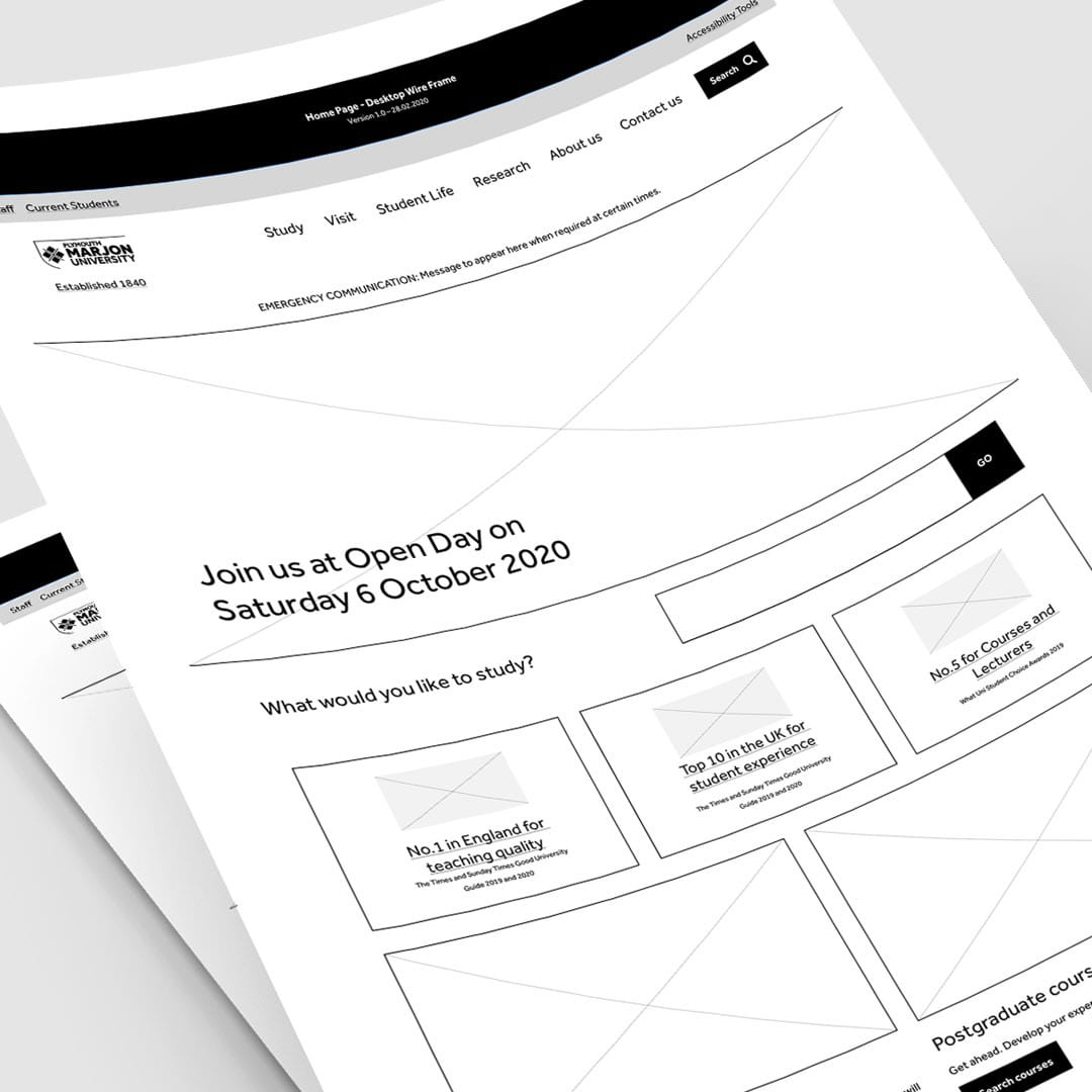 Always start with the information design. Wireframes set out the modules on the page so you can focus on structuring the user interface, without being distracted by brand and design.
We work in black and white, focusing on the layouts and the user paths through the website. Block layouts establish the information design for every page. Alongside this we decide which links would go into the main navigation. We’d previously used the card sorting method, where you ask users how they would organise your info, so we were able to pretty much stuck to what we had.
The discussions were complex. What does each feature need to do? How will it work? How would we make it accessible?
Here are some of our talking points:
- Consistent experience, regardless of technology or network conditions
- Predictable navigation and consistent use of labels
- Tab order and how screen readers would navigate the page
- The size of the click and touch points on interactive elements
- Effective signposting with clear titles and call to action buttons
- Content operating in predictable ways (we put a 2 column at the core of our design)
- Text sizes and text line length for legibility
- Contrast ratios between text colour and background colour
- Avoiding the use of colour alone to make information understandable
- Labelling, inputs and ‘steps’ on forms so users can understand where they are
- How to deal with embedded widgets
- How to get and display video transcripts
- Inaccessible pdf and word documents on the website – they had to be recreated
Our web team is four people. I’m on marketing, Simon on design, Kieron on front-end development, Ian on infrastructure and integration, and all of us on testing. The responsibility for putting an accessible website together spans all these roles and needs lots of collective discussions.
Tip: Accessibility spans design, code and content; the whole team must live it.
Design
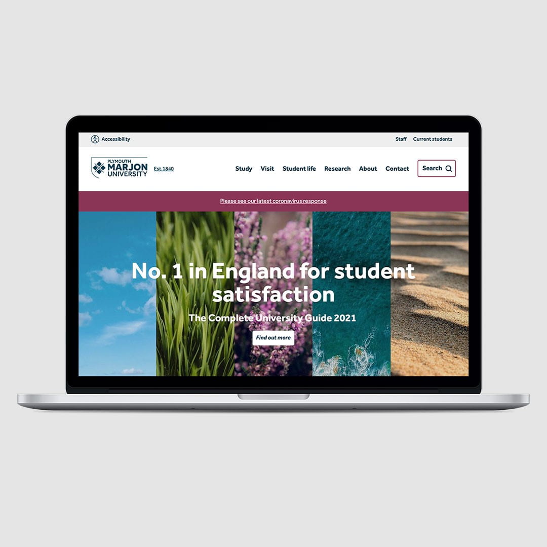
 We want a clean and clear design, easy to read and navigate. It needs to feel vibrant and welcoming, because that is what it feels like to be at Marjon. We go through a few rounds of designs and feedback, getting closer each time until we had it; the one that made us go ‘wow’.
This is how Simon, our designer, explains it:
“Accessible websites are often stripped down to their most basic design and functionality in order to comply. The award winning Marjon website was already appealing to the 80% of its visitors without disabilities, so retaining their interest was important when creating an accessible site that worked for the additional 20% of visitors with disabilities. We worked hard to inject the essence of ‘Marjon’ on every page by using colour, typography and imagery, resulting in fresh and information-led page layouts by way of an easy-to-use navigation – all completely accessible.”
Prototype and user testing
Next we build a prototype with two pages and test it on real people, all of whom have a disability. We run eight hour long one-to-one user experience tests with half of the people using desktops and the other half using mobile devices.
Don’t assume user testing is too expensive, it doesn’t have to be. You can make it fit whatever you can afford. I scripted the questions and we tested in-house, at a cost £20 per user in incentives. We typed up the answers verbatim and from there it took no time to find out what was and wasn’t working for our users. We then reiterate the designs based on real user feedback.
We ask the users a few questions about their disability and how it influences their online experience but most of the questions were general ones. Here are some of the questions:
- What is the first thing you notice?
- What can you do on this page?
- Which bits of this page are helpful to you?
- Does this feel like Marjon [insert your brand here!]? Why or why not?
- Please tell me the three words that you think best describe your impressions of this page?
- Does anything feel out of place or unnecessary on this page?
- What score would you give this page out of 10?
- Did you experience any challenges in using this prototype that relate to your disability?
Tip: I always get something unexpected from testing websites with real people. Keep it small and simple if that is all you can do in terms of budget or time, but make sure to do it!
Custom accessibility tools
 We were by now used to considering people with a wide range of disabilities and it was crystal clear that there is no one-size-fits-all option. We decide it would be even better if users could optimise the website based on their own needs, for example someone with dyslexia might like to change the default font while someone who is colour-blind might like to change the colours.
We developed our own accessibility tools to enable people to do just this. You want to change the font size, spacing or type? You want to change the background and text colours? You got it!
Build and testing
The deadline looms. We’re in a flurry of testing and daily catch ups until everything is ready to go live. If you’d like a summary of what we built then check out our accessibility statement. Our testing includes manual accessibility testing and automated accessibility testing tools, as well as the usual browser and functional testing. The team pull out all the stops (and then some). The new website goes live.
We celebrate. We sleep. We wait…
Search engine optimisation (SEO)
We didn’t set out just to make an accessible website. We had set out to make a much faster one. Website speed influences both search engine rankings and how long your users stick around.
Did it work? Yes. We’ve seen a step change in organic page views from search engines, a big one. Plus page load speed is down 54% and bounce rate is down 9%.
We’re got an inclusive and welcoming website and I’m proud of our little team for creating it, especially given the added challenges of the lockdown. We’d love for you to check it out at www.marjon.ac.uk and would welcome any feedback or suggestions in the comments.
Final thoughts
It turns out that that web accessibility is far from being essentially a technical thing. It’s a chance to get creative, to chase some opportunities and ultimately to make your brand better at communicating with your audience. If you’re a digital marketeer then web accessibility has to be firmly on your radar.
